Editing Widgets
Widgets are the building blocks of your site. You can customize widgets to adjust the appearance and layout of your site. Editing widgets allows you greater control over what features your site has and how these features behave. Whether you are looking to capture leads, lead visitors from page to page, show off images, or put an important message in a paragraph, widgets can help.
For information about adding widgets to your site, see Add Widgets.
To edit a widget, hover over the widget, and right-click the widget to see the context menu. Every widget has different options, but the following are common to almost every widget.
Edit Design
You can change the style of the widget, including color, text, images and more, as well as change the blank space surrounding the widget.
Click a widget, and click the Design tab.
Entrance Animation
Allows you to customize how the element appears on the screen; for example, fading in, bouncing in, or zooming in.
Right-click the widget, click Entrance Animation, and select an animation.
Select Container
Selects the column or row this widget is contained in, allowing you to easily find and edit it.
Right-click the widget, click Select Container, and select Column or Row.
Copy and Paste
Copying a widget saves it so that you can paste it later in another location. The paste option only appears if you have a widget that has been copied.
Right-click the widget, and click Copy or Paste.
Hide on Device
Use the hide on device feature to change your content depending on the device your visitor uses to access your website. For example, show a click-to-call widget for mobile users or a contact form for desktop users. Widgets hidden by the Hide On Device feature are not deleted; you can see all of the hidden elements on a page by clicking Unhide Elements at the bottom of the left panel. For more information about hiding on devices, see Show Hidden Elements.
Right-click the widget, click Hide On Device, and select a device.
Set as Anchor
Anchor links let you send visitors to a specific section of the page, making it easier for them to get from place to place on a longer page or to a specific section that you want to reference. For more information about anchors, see Anchor Tags and Links.
Right-click the widget, and click
Set As Anchor.
Alignment
Set whether the widget is aligned to the left, right, or center of its area.
Some widgets behave very differently in different views. Check the way your widget displays in each view after adding it to make sure it displays correctly.
To set the alignment, right-click the widget, and click an Align Left, Align Center, or Align Right icon.
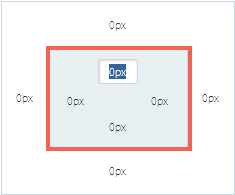
Outer and Inner Spacing
Outer spacing and inner spacing are the space around a widget. Outer spacing is also know as margin, and is the space outside of the element's borders. Inner spacing is also known as padding, and is the space inside these borders. When you adjust the outer spacing and inner spacing of a widget, you change its placement and appearance. This can make your site look more customized and professional.
To adjust the outer and inner spacing around a widget:
- Right-click on any widget, element, column, or row, and then click Edit Design.
- Click the Spacing tab.
Note:
If you see odd spaces that you cannot remove, be sure to check all parts of the widget, including the column in which it is located.
Outer Spacing
To change the outer spacing (margin), click and edit the numbers in the outer box. You can also click on one of these numbers and use the slider to adjust the size.
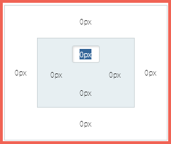
Inner Spacing
To change the inner spacing (padding), click and edit the numbers in the inner box. You can also click on one of these numbers and use the slider to adjust the size.