
Advanced Slider Widget
Content Editor
To access the content editor, right-click the widget, and click Edit Content.
To add a new item click the +Add Another Slide option which appears under the existing items in your widget, this will then give you the pop-out panel to populate the details for this item.
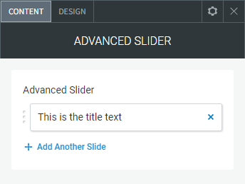
To edit the details of an existing slide in your widget, click the item in the list and then use the fields in the pop-out panel to edit the item.
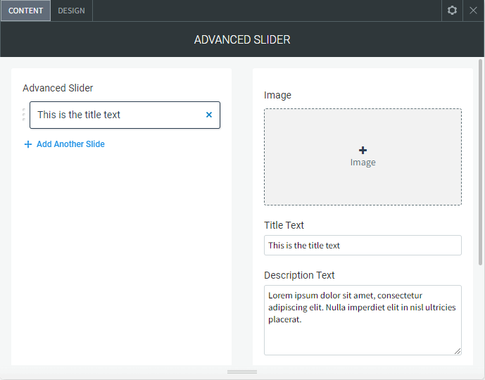
The following fields and options can be set for each individual item in your widget:
Image
To add an image to the slider, click Add Image or by click any blank image spot. This opens the image picker. You have the following options:
- Select the folder with images you want to use.
- Click the + icon to upload your own image.
- Click Full View for more image choice options.
- Remove Images.
In the Content Editor, click the gray
X at the top corner of the image thumbnail to delete it.
- Image Settings. Click an existing image in the content editor to open the Image Settings.
- Edit and Replace Images
- To open the image picker and select a different image, click Replace.
- To open the built-in image editor to add features and styles to an image, click Edit.
Slide Icon
You can add a large icon behind the text (or by itself) for each slide with or without an image.
NOTE: To see the icon option you need to turn on "Enable the icon options to a slide" under "DESIGN > Additional Settings" expandable tab.
Choose Icon. To add an icon to the slider, click Add Icon or by click any blank image spot. This opens the icon picker. You have the following options:
- Search for icon. You can type in the field to look for a specific icon
- All Icons Dropdown. You can choose an icon from different categories
- Icon selection. A visible list of all the icons
Upload SVG File. You can also upload a SVG icon format directly from your computer.
Additional Settings
You have the following additional options in the Image Settings:
- Title Text. The large text that appears over the image.
- Description Text. Small text that appears below the title text designed for a small paragraph.
- Show/Hide Button. Show or hide a button below the text.
- Button Text. The text that appears in the button.
- Button Link. Set the link for the button.
Logo/Image Above/Below
You can add a image file above or below the slider text.
NOTE: To see the logo/image options you need to turn on "Enable a logo/image above/below the text" under "DESIGN > Additional Settings" expandable tab.
To add an image use the same settings as the above, under image.
- Logo/Image Height (px). Set the height of the image, the width will adjust relative to the height.
- Margin Top/Bottom (px). Set the margin above or below the image.
Design Editor
To access the design editor, right-click the widget, and click Edit Design.
Slider Layout
- Slider Height. Height of the image slider.
- Slide Animation. You can set the slides to transition by slide or fade.
- Transition speed between slides. The speed between each slides transition.
- Pause time on each slide. The time you get to stay and read/view each slide.
- Overlay Opacity. The transparency colour amount over the image slider.
- Rounded Corners. Set rounded corners on the image.
- Layout. Turn on/off the sliders arrow navigation and bullet navigation.
- Arrow Colour. Colour of the arrows either side.
- Arrow Size. Size of the arrows.
- Bullet Navigation Colour. The colour of the navigation bullets.
Content/Text Layout
- Margin Below Text. The margin between the title, description text and button.
- Text Container Layout. Align the text position inside the container.
- Text Alignment. Align the text direction.
- Content Container Width (%). Change the percentage width of the text area over the image.
- Background Behind Text. Set a colour behind the text over the slide.
- Rounded Corners. If you set a background colour behind the text you can set rounded corners.
- Padding Top/Bottom, Left/Right. Add padding to the top, bottom, left and right of the text in the text container, mainly used when background colour is added.
- Margin Outside of The Text Box top/bottom/left/right. Add a margin to the top, bottom, left and right of the text outside the text container, mainly used when background colour is added.
Content/Text Design
- Layout. Turn the shadow on the text on or off.
- Title Text. Design the title text.
- Description Text. Design the description text.
- Button. Design the button (It will use your websites default button design).
Additional Settings
- Enable the icon options to a slide. Turn on the option to add a icon to the background of a slide or over the slide image.
NOTE: To see the icon options below you need to turn on "Enable the icon options to a slide".
- Icon Colour. The colour of the icon
- Icon Size. The size of the icon
- Icon margin from the top of the side.
The distance from the top of the slide to the top of the icon.