
Side-by-Side Slider Widget
Content Editor
To access the content editor, right-click the widget, and click Edit Content.
To add a new item click the +Add Another Slide option which appears under the existing items in your widget, this will then give you the pop-out panel to populate the details for this item.
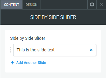
To edit the details of an existing slide in your widget, click the item in the list and then use the fields in the pop-out panel to edit the item.
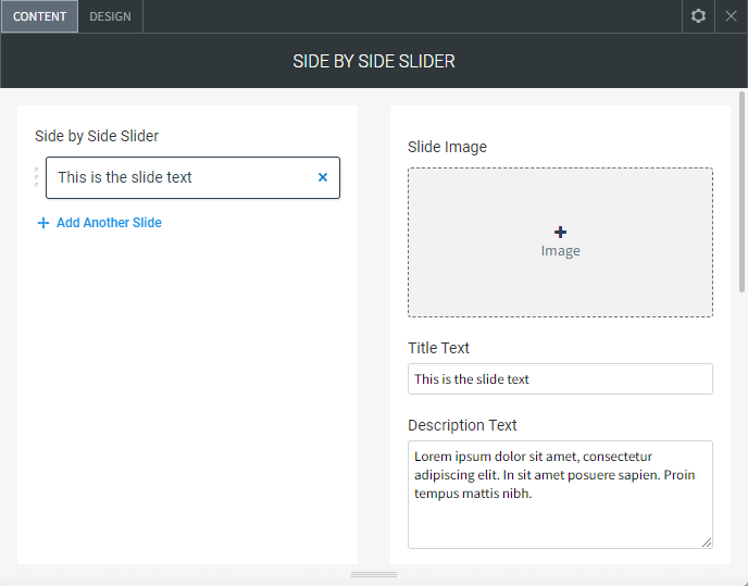
The following fields and options can be set for each individual item in your widget:
Slide Image
To add an image to the slider, click Add Image or by click any blank image spot. This opens the image picker. You have the following options:
- Select the folder with images you want to use.
- Click the + icon to upload your own image.
- Click Full View for more image choice options.
- Remove Images.
In the Content Editor, click the gray
X at the top corner of the image thumbnail to delete it.
- Image Settings. Click an existing image in the content editor to open the Image Settings.
- Edit and Replace Images
- To open the image picker and select a different image, click Replace.
- To open the built-in image editor to add features and styles to an image, click Edit.
Additional Settings
You have the following additional options in the Image Settings:
- Title Text. The large text that appears over the image.
- Description Text. Small text that appears below the title text designed for a small paragraph.
- Show/Hide Button. Show or hide a button below the text.
- Button Text. The text that appears in the button.
- Button Link. Set the link for the button.
Design Editor
To access the design editor, right-click the widget, and click Edit Design.
Slider Settings
- Image Slider Height. The height of the image slider.
- Slide Animation. You can set the slides to transition by slide or fade.
- Transition speed between slides. The speed between each slides transition.
- Pause time on each slide. The time you get to stay and read/view each slide.
- Layout. Swap the text and image from left to right.
- Bullet Navigation Colour. The colour of the circle/bullet navigation items.
- Arrow Colour. Colour of the left and right arrows.
- Arrow Size. The size of the arrows.
- Layout. Turn on/off the arrows and navigation bullets/circles.
Text Container
- Layout. How you want the text aligned within the text area.
- Background. The background colour of the text area.
- Padding Left/Right. The padding left and right of the text.
- Padding Top/Bottom. The padding top and bottom of the text.
- Margin Below All Text Fields. The margin between the title, description text and button.
- Title. The family, size and colour of the title font.
- Description. The family, size and colour of the description font.
- Button. The style of the button.
Image Container
- Layout. The image alignment inside the image container including changing the image into a circle.
- Overlay Opacity. The level of colour over the image.
- Border Radius. Rounded corners on the image.
- Angle Image Container Edges (Top Right, Top Left, Bottom Left, Bottom Right). Give the image container an angled edge, works best using the image layout "Image Full Background"
- Border. Set a border around the image.
Show/Hide Elements
- Show/Hide Title. Hide the title text field on all slides.
- Show/Hide Description. Hide the description text field on all slides.
Advanced Settings
- Image Container / Text Container Width (%). Change the width of the text and image containers as a percentage, its important that both values equal 100% to not break the layout.
- Padding Left/Right of The Arrows. Shift the text and image inwards away from the left and right arrow navigation.