
Events Widget
To see a live preview of this widget please visit our demo site https://www.smithjones.co.nz/events
Content Editor
To access the content editor, right-click the widget, and click Edit Content.
To add a new item click the +Add Event option which appears under the existing items in your widget, this will then give you the pop-out panel to populate the details for this item.
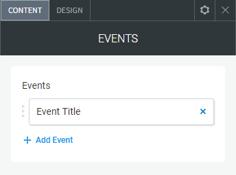
To edit the details of an existing event in your widget, click the item in the list and then use the fields in the pop-out panel to edit the item.
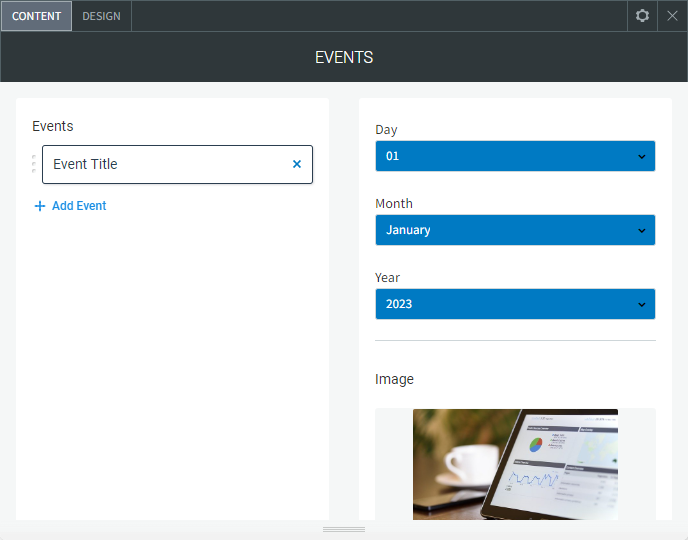
The following fields and options can be set for each individual item in your widget:
- Day. Day of the event
- Month. Month of the event
- Year. Year of the event
Image
To add an image to the slider, click Add Image or by click any blank image spot. This opens the image picker. You have the following options:
- Select the folder with images you want to use.
- Click the + icon to upload your own image.
- Click Full View for more image choice options.
- Remove Images. In the Content Editor, click the gray X at the top corner of the image thumbnail to delete it.
- Image Settings. Click an existing image in the content editor to open the Image Settings.
- Edit and Replace Images
- To open the image picker and select a different image, click Replace.
- To open the built-in image editor to add features and styles to an image, click Edit.
- Show/Hide Image. Show or hide the image
- Event Title. The title/name of the event
- Location Address. The address of the event if applicable to the event
- Show/Hide Location. Hide the location if not applicable to the event
- Get Directions Button - Google Maps - Share Link. Add a link to a Google Map, to get the link from Google Maps, find the location, click the Share button and copy the "Link to Share".
- Show/Hide Get Directions (Google Map) Button. Hide the directions/Google Map button if not applicable to the event
- Start Time (AM/PM). State the start time of the event and if that time is in the AM/PM
- End Time (AM/PM). State the end time of the event and if that time is in the AM/PM
- No end time. Hide the end time if the event has no set end time
- Show/Hide Time. Hide the start/end time if not applicable to the event
- Short Event Description. A short description of the event
- Show/Hide Short Description. Hide the short description if not applicable to the event
- More Details. The text that expands when you click on the "More Details" button
- Show/Hide Expanded Description. Hide the extra expandable content text
- Register Button Text. The text on the Register Button - This button is designed to allow you to link to a page where you can create a form to collect registrations.
- Register Button Page/URL. The link/URL where the register button goes to
- Show/Hide Register Button. Hide the register button if not applicable to the event
Design Editor
To access the design editor, right-click the widget, and click Edit Design.
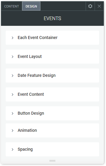
Each Event Container
- Background. Background of each of the events containers
- Border. Border on each of the events containers
- Rounded Corners. Add rounded corners on each of the events containers
- Container Padding Top/Bottom - Left/Right. Padding top, bottom, left and right of the event container
Event Layout
- Event Layout. Switch between a vertical and horizontal layout
- Date Feature Position. Using the horizontal layout, you can align the date feature to the left, right or over the image
- Image Margin Left/Right - Top/Bottom. Margin left, right, top and bottom of the event image
- Information Margin Left/Right - Top/Bottom. Margin left, right, top and bottom of the event information
- Background Image Overlay. A dark transparent overlay over the image if used
Date Feature Design
- Background Colour. Background colour of the event date feature
- Background Colour Hover. Background colour of the event date feature on hover
- Rounded Corners. By default set to 50% which appears as a circle, if reduced it will display as round corners on a square
- Container (Circle) Size. The event date feature container size
- Border. Border around the date feature container
- Month Text Style. The text style of the month text
- Day Text Style. The text style of the day number
- Year Text Style. The text style of the month number
Event Content
- Event Title. The text style of the event title
- Time and Location. The text style for the time/location text
- Short Event Description. The text style for the short description
- Full Event Description. The text style for the full event/expandable description
Button Design
Get Directions Button
- Button Background. Button background colour
- Button Background Hover. Button background colour on hover
- Button Text Style. Change the button text style
- Button Padding Top/Bottom - Left/Right. Button padding top, bottom left and right
- Border. Border around button
- Rounded Corners. Rounded corners on the button
More Details Button
- Button Background. Button background colour
- Button Background Hover. Button background colour on hover
- Button Text Style. Change the button text style
- Button Padding Top/Bottom - Left/Right. Button padding top, bottom left and right
- Border. Border around button
- Rounded Corners. Rounded corners on the button
Register Now Button
- Button Background. Button background colour
- Button Background Hover. Button background colour on hover
- Button Text Style. Change the button text style
- Button Padding Top/Bottom - Left/Right. Button padding top, bottom left and right
- Border. Border around button
- Rounded Corners. Rounded corners on the button