
Service Plans Widget
To see a live preview of this widget please visit our demo site https://www.smithjones.co.nz/service-plans
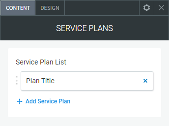
Content Editor
To access the content editor, right-click the widget, and click Edit Content.
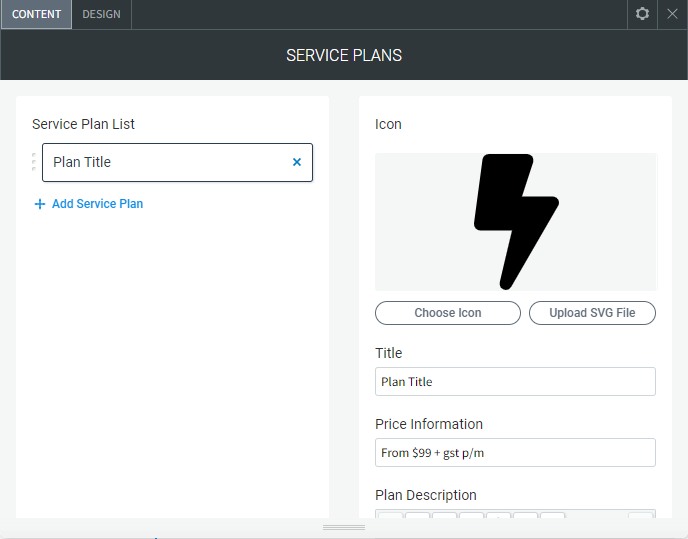
To add a new item click the +Add Service Plan option which appears under the existing items in your widget, this will then give you the pop-out panel to populate the details for this item.
To edit the details of an existing service plan in your widget, click the item in the list and then use the fields in the pop-out panel to edit the item.
The following fields and options can be set for each individual item in your widget:
Icon
Choose Icon. To add an icon to the slider, click Add Icon or by click any blank image spot. This opens the icon picker. You have the following options:
- Search for icon. You can type in the field to look for a specific icon
- All Icons Dropdown. You can choose an icon from different categories
- Icon selection. A visible list of all the icons
Upload SVG File. You can also upload a SVG icon format directly from your computer.
- Title. The service plan title
- Price Information. The service plan price
- Plan Description. The service plan description
- List Bullet Icon. The icon for the bullet list in the expandable description content
- Expand Button Text. The text for the expandable button
- Expanded/More Information. The content for the expanded area
- Show/Hide Expandable Content. Hide the expand button and expanded content
- Enquiry Button Text. The text for the enquiry button
- Enquiry Link. The page/URL where the enquiry button goes to
- Show/Hide Enquiry Button. Hide the enquiry button
- Most Popular Ribbon. Show the 'Most Popular' ribbon
- Ribbon Text. The text that displays in the 'Most Popular' ribbon
Design Editor
To access the design editor, right-click the widget, and click Edit Design.
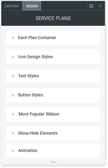
Each Plan Container
- Each Plan Container Width. The width of each service plan container
- Layout. The layout alignment of the service plan containers
- Each Plan Margin Top/Bottom - Left/Right. The margin top, bottom, left and right of each service plan container
- Each Plan Container Border. The border around each of the service plan containers
- Plan Header Height. The height of the header with the icon and title in it
- Plan Header Background Colour. Background colour for each service plan
- Plan Header Background Colour Hover. Background colour for each service plan on hover
- Plan Content Background. The background colour behind the content (under the header)
- Content Padding Top/Bottom - Left/Right. The padding top and bottom of the content (under the header)
Icon Design Styles
- Icon Colour. The colour of the icon
- Icon Colour Hover. The colour of the icon on hover
- Icon Size. The size of the icon
- Icon Background Colour. The colour of the background behind the icon
- Icon Background Hover Colour. The colour of the background behind the icon on hover
- Icon Background Rounded Corners. The rounded corners of the container behind the icon (50% makes the container a circle)
- Icon Background Dimensions. The size of the container behind the icon
- Icon Background Border. The border around the container behind the icon
- Icon Background Border Hover. The border on the container behind the icon on hover
Text Styles
- Plan Title Style. The style of the service plan title text
- Plan Price Style. The style of the price text
- Margin Below Price. The margin below the price text
- Plan Description Style. The style of the short description text
- Plan Expanded Text Style. The style of the expanded content text
- Content List Bullet Colour. The icon/bullet colour in the expanded content
- Link Style. The link style in the content
- Link Hover Colour. The link style in the content on hover
Button Styles
'Enquire About This Plan' Button
- Button Background Colour. Background colour on the button
- Button Background Colour Hover. Background colour on the button on hover
- Button Padding Top/Bottom - Left/Right. Padding inside the button
- Button Text Style. The text style on the button
'More Information' Button
- Button Background Colour. Background colour on the button
- Button Background Colour Hover. Background colour on the button on hover
- Button Background Colour Active. Background colour on the button when active
- Button Icon Colour. The icon colour on the button
- Button Icon Colour Hover. The icon colour on hover
- Button Icon Colour Active. The icon colour when active
- Button Padding Top/Bottom - Left/Right. Padding inside the button
- Button Text Style. The text style on the button
'Most Popular' Ribbon
- Ribbon Background Colour. Background colour on the ribbon
- Ribbon Font Colour. The font colour on the ribbon
Show/Hide Elements
- Show and hide specific elements on all service plans
- Show/Hide Icon.
- Show/Hide Title.
- Show/Hide Price.
- Show/Hide Description.